Field guide
Measuring activation ROI
The four metric layers that survive a budget review, the instrumentation to set up before doors, and the vanity numbers to leave out of the recap deck.
Experiential marketing has a measurement reputation problem, and it earned it — too many recap decks where “brand lift” means a mood and “impressions” means a guess multiplied by a bigger guess. It doesn’t have to be that way. A live activation produces unusually countable things: pieces made, people served, scans collected, minutes dwelled. Here’s the four-layer framework we hand clients, in ascending order of how much your CFO will respect it.
Layer 1: Production metrics (the floor)
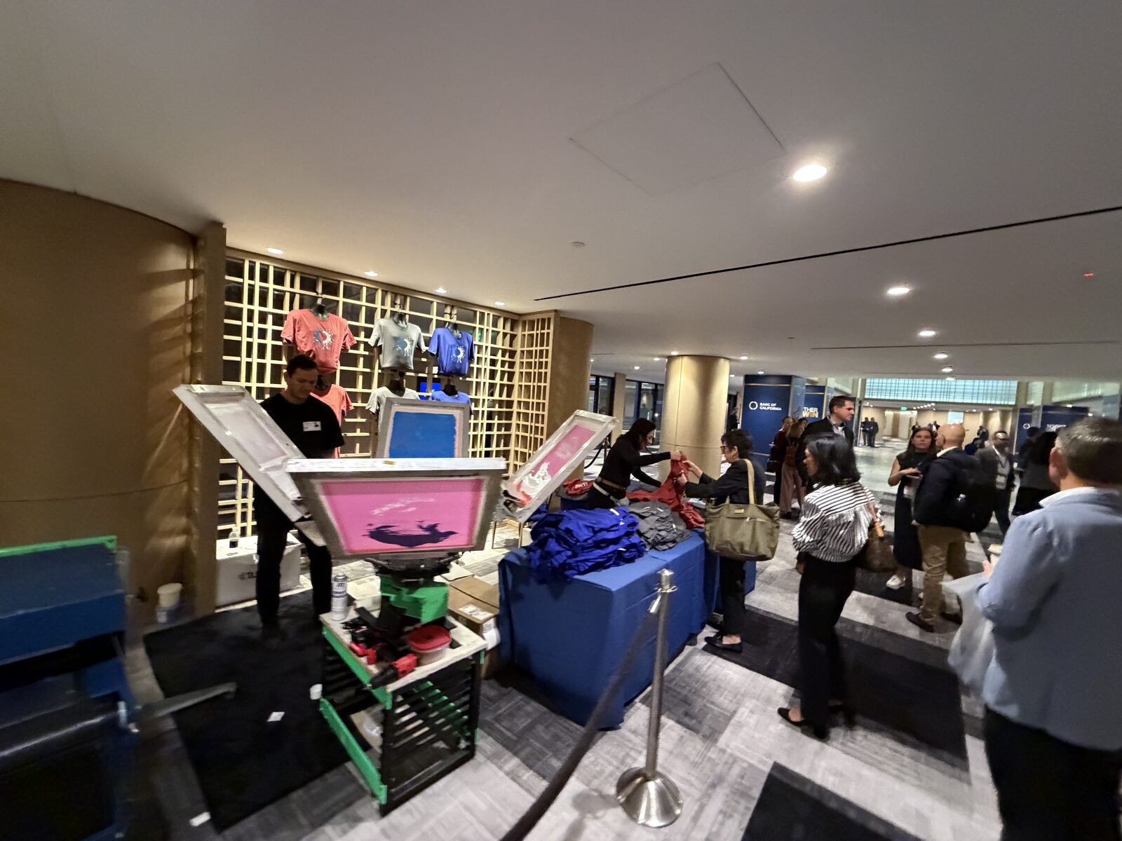
What was physically made and given: pieces produced, by format and hour; unique guests served; peak throughput; service uptime. These come free with a competent crew — we track per-press counts as a matter of course. Alone they aren’t ROI, but they’re the denominator for everything else, and “612 shirts printed for 575 unique attendees across four hours” is already a more solid sentence than most recap decks contain.
Layer 2: Engagement metrics (the behavior)
Dwell time, queue participation rate, and abandonment. Estimate dwell honestly: average queue length × average service interval is a fine field method, and a camera-counted sample hour is better. Compare against your booth’s no-activation baseline — this is the multiple that justifies the spend. At trade shows we routinely watch activation booths hold attendees 3–5× longer than neighboring footprints; your number, measured, is the one that belongs in the deck.
Layer 3: Capture metrics (the pipeline)
This is where activations beat sponsorships in any spreadsheet: gate the experience with a measurable action. Badge scan to join the line, QR design-picker that doubles as an opt-in, demo completion for line-skip privileges. Now every shirt has a contact attached, and ROI math becomes pipeline math: scans × your historical lead-to-opportunity rate × average deal value, versus total activation cost. For a $15K activation capturing 500 scans, the break-even conversion rate is usually embarrassingly small — run your own numbers and check.
Layer 4: After-life metrics (the compounding)
The merch keeps working after load-out, and you can watch it: tagged posts and stories during and after; a unique QR or URL printed on the garment’s care tag or hem driving a trackable destination; wear-spotting at your own subsequent events (the kickoff shirt reappearing at the next all-hands is retention data wearing a human). Be conservative converting wears to “impressions” — the credibility of the whole deck depends on the weakest multiplication in it.
Retire these from the recap
- “Total event attendance” as your reach — you served the queue, not the keynote.
- Ad-equivalency math — nobody believes the exchange rate, including the people presenting it.
- Unanchored sentiment — “guests loved it” without a participation or repeat-engagement number attached.
Build the baseline for next time
The first measured activation is worth more than its own results — it’s the baseline that turns every future event into an experiment. Pieces-per-hour by format, scan rate per hundred queue entrants, cost per captured contact: once those numbers exist, the next planning meeting stops debating opinions and starts comparing options. Keep the recap to one page with the three headline numbers up top; the deck nobody finishes reading helps nobody’s budget.
The pre-event checklist
Pick two or three metrics that map to the activation’s job (per the planning guide, you wrote that job in one sentence). Set up the gate, the counts, and the camera angle before doors. Tell the crew what you’re counting — ours will track production splits hourly if you ask, and you should ask. Measurement isn’t a recap activity; it’s a setup activity that recaps gratefully.
From the blog